
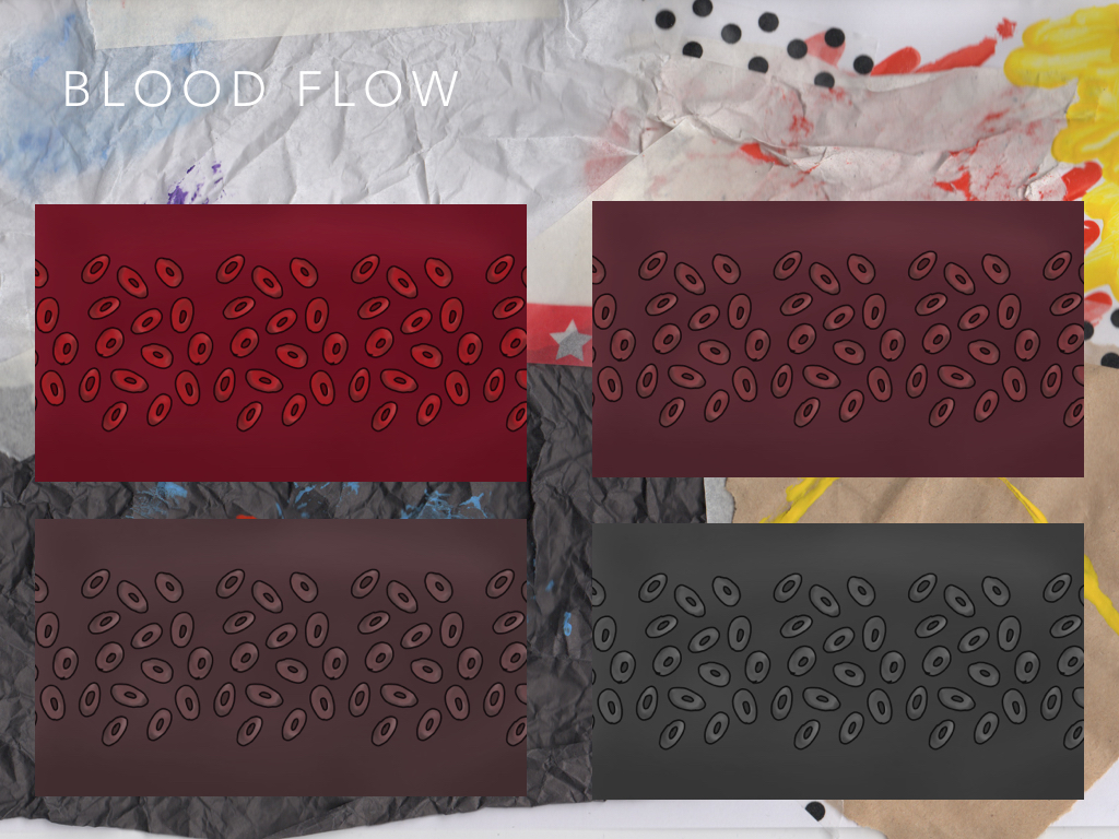
These are the start of my Art of Pages. I'm trying to create it in the style of a scrap book and found that its hard o create this digitally so I've started making some of the backgrounds by hand and scanning them in.
I think I need to place the images at wonky angles and add 'tape' everywhere to push this further.


Hi Beckie,
ReplyDeleteSome good stuff going on here. But my immediate response is to simplify a little. I love the idea of hand made textures and backgrounds that reflect the real world. But the current background is far too cluttered and detracts from the work itself. My suggestion would be to use a simpler version of this background. Perhaps just a single real world, brown paper texture. Rather than a mess of multiple textures. It nicely echoes the world you are creating, but currently makes it difficult to focus on the actual work.
I think the text could also be more playful. I like simple text for blocks or paragraphs. But titles can be a good place to express tone. So, something playful and full of life.
Once you have this simpler base, you could reassess how you present each image. Rather than simply placing a page of sketches over the top of a background, perhaps place each sketch individually. See here for a great example from Bharathi (alumni) - https://www.scribd.com/doc/140579263/Num-Num-The-Making-Of
Here are a few more examples to help inspire - http://ucarochester-cgartsandanimation.blogspot.co.uk/2016/02/fao-caa-year-1-story-commission.html
Largely, the tone is great. But it needs finesse so that the work is on show. Let the graphic design support the work, rather than take away from it. Looking forward to seeing the next iteration!