Saturday 31 March 2018

Art Of Progress | Major Project | Year 3

I've been remastering my current Art Of to look a lot more professional and updating it along the way with renders and screenshots of my work.  Here's a sneak peak of the Art Of so far...

The current cover to the Art Of. It currently features one of the lighting renders but eventually I think I may change this to a similar shot featuring all of the models from the project
Chapter 1: Behind the Art. This is one of the double page contents/chapter pages that I've designed. The render covers the 2 pages and helps to tie it all together. 

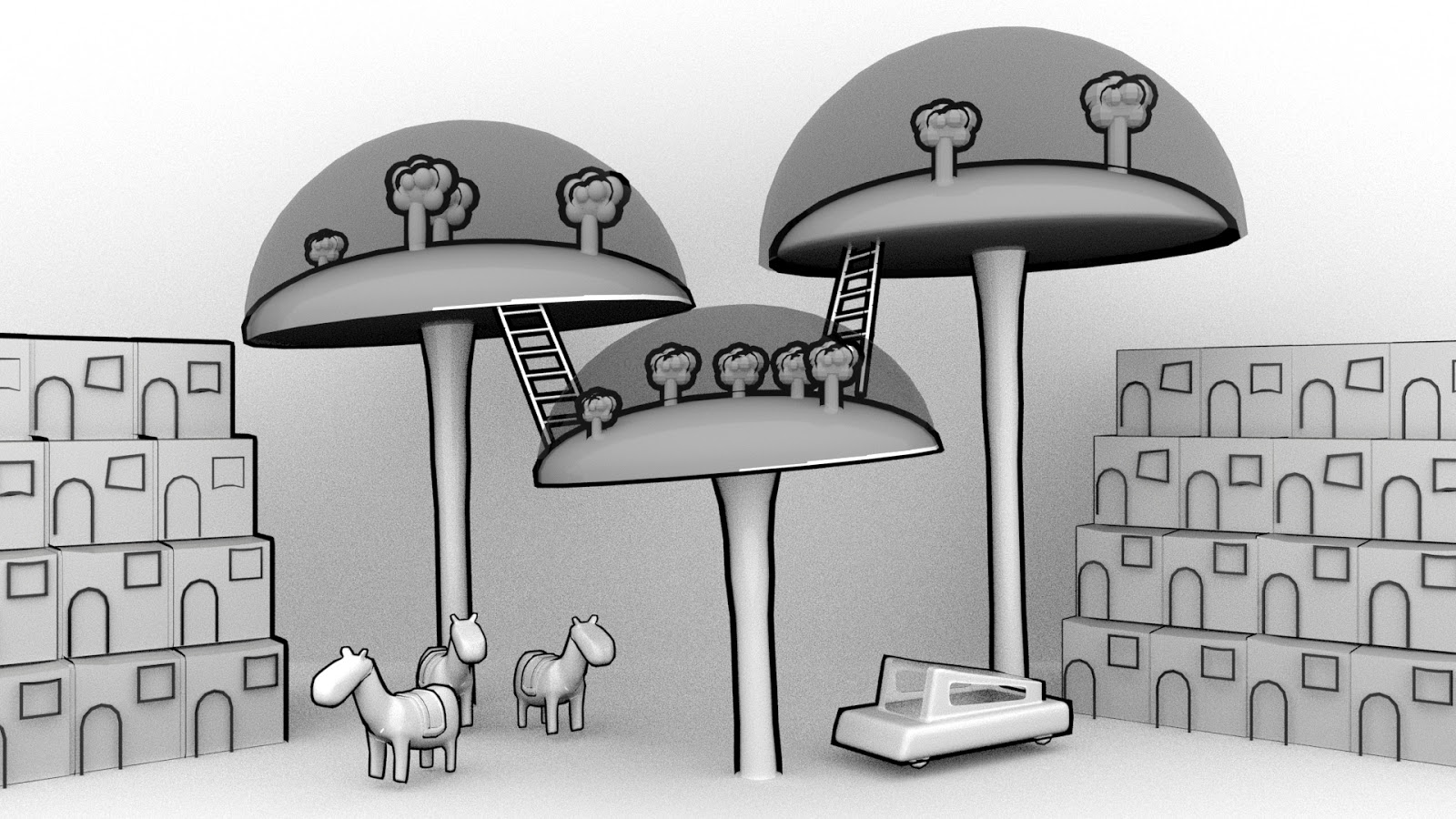
This is the double page spread for the questions. It felt strange trying to dedicate a singular page to just 8 questions so I've included an early coloured render of the domes too.
The double-page spreads are dedicated to the questions and responses have been given a cleaner look too.

The collage of imagery responses may be updated in time but currently, I'm a lot happier with the fonts and colours I've chosen. I'm hoping to make it a running theme throughout the Art Of. I'm yet to add any branding to the mix but so far my work feels a lot more professional, cleaner and more organised. 

Coloured Lighting | Major Project | Year 3

I've been testing some coloured lighting on my model collection to try and remove the 'dystopian feel' that the white/greyish renders were giving it. Originally the testing didn't go to plan and I pretty quickly had a steep learning curve with the new Arnold lighting system as spotlights did the very opposite thing that I wanted them to do.

I tried adding a blue spotlight above the horses. This strangely dyed everything else in the scene blue other than the horses! The next 15 renders and lighting tests all looked very similar too no matter what I tried and the horses still didn't appear to like coloured lights. Eventually, I had to settle for some tests with an overly large directional light that coloured the entire scene. These, in turn, gave me an opportunity to blend or merge 2 different ones together in photoshop. 

Orignial lighting test with blue spot light.


Red lighting

Steel grey lighting

Steel blue lighting

Peach and light blue merged render

White and peach merged render

Friday 23 March 2018

Texture Experiments | Major Project | Year 3

Following on from my last post, I got some expert advice from Ethan Shilling. He told me it might be best to play about with the thin wall option and subsurface settings.

The 'tracing paper' texture is on everything within the scene but with the changes, it seems to work best with the background. This may be to do with how thick the models are or in the case of the domes and the pods just how complex they are. There is no internal lighting as of yet but that is the next step. 

These small changes have definitely helped with the overall colour of the scene but have started to give a 'washed-out' effect. Many more tests are needed yet!
Where things were left last time. (For comparison only)
Thin-walled texture option applied and subsurface changed to 0.5
Thin-walled texture with subsurface increased to 0.75 and the emission weight increased to 0.2

Thursday 22 March 2018

Lighting Experimentation | Major Project | Year 3

Lighting today still isn't going to plan. Since switching to the Arnold rendering software I'm struggling to create/find a light/light combo that will light my work nicely. At the moment none of these models are lit internally which will, in turn, affect the render once again. This is just some of the renders from today and the beginnings of the experiments that are underway to fix the dull grey appearance of the renders.

Original Lighting
Lighting increased to 1.5
Lighting at 1.5 with samples increased to 4
Lighting at 1.5 with samples increased to 4 (test 2)
Lighting now increased from a skydome and an area light to a skydome and 3 arealights

Monday 19 March 2018

Progress with Textures and Outlines | Major Project | Year 3

This is how far I've managed to get in terms of a tracing paper texture that can be backlit. Here I used a smaller cube with the glow texture half in and half out of the main cube. I'm not sure how much thinner I want to go to replicate tracing paper but the colour is not far off.
Continuing on my with my toon outline experimentation, I've begun testing it on some of my other models. The outline on the domes is the same on the car but due to the size difference, it doesn't look right.
Thinner outline applied to the car and tested with some of the horses as well. Sizing is off but gives a nice group shot of the models so far.
Pod houses added in. Toon outline doesn't seem to work so well of these for some reason. It doesn't want to show the lines between the pods even with some tweaking. So I'm not sure if it is a thickness issue, a rendering issue or even an angle issue. I think it's going to take some further experimenting to fix it.


Wednesday 14 March 2018

Feedback Wanted | Outline Testing | Major Project | Year 3

Continuing on from my work for the minor project, I've been continuing my experimentation for the texture. I'm aiming for a tracing paper feel with a black outline.
So far this is the closest my texturing has come to a tracing paper look and feel. It's still not quite right but it is semi-translucent and offwhite. 
For this render, I added a toon outline to all aspects of the model. It really doesn't work well on the glass domes.

For this render, I removed the toon outline from the domes and it already looks a lot better.

This outline method involves making individual lines from cylinders and deforming them before putting them in place.
Moving forward, I think I'm going to change the glass texture to a more transparent tracing paper texture that I've developed but I'm battling to light it internally so we don't lose sight of the trees inside of it.

There are a few more methods I could try but so far I can't decide which is more effective as I think they both work well. Any feedback would be appreciated.