I found an 'Antiques' colour palette in Illustrator which I think fits the best. To try this out, I have made my starting screen and recoloured the start to the 'What Your Teacher Doesn't Tell You' Video. Both of these look really effective and this will be the colour palette that I use from now on.
Showing posts with label photoshop. Show all posts
Tuesday, 7 February 2017
Thursday, 22 December 2016
Tuesday, 22 March 2016
Paper Texture Tests and Experimentation | Photoshop | Fantastic Voyage
These are part of my texturing experimentations for use in the animatic, pre-vis and final piece. These 9 tests here are free ones sourced from the internet. I'm going to create some of my own textures and use these as a comparison.
1. looks most genuine
6. is a nice texture but just a little too dark for use
7 gives it a wooden effect.
Saturday, 19 March 2016
Front of Box Redesign | Photoshop | Fantastic Voyage
Following on from the feedback I received in the pitch, I have begun to restyle and redesign many of the components in my work. For the box itself, I have got rid of the theatre front and started experimenting with making it more box like and childish. I've also began to experiment with over layering some textures into them and It is definitely helping and given the 4 variations a better depth and more appeal than a flat, plain colour. I've also tried to experiment a little with text and the kid that the child making this would use stickers or have a younger sibling who might scribble on the box.
My favourite Is the top left. It has a more childish aspect to it but feels more a 11 or 12 year old has created it. It still has a childish look and feel but the stickers look more decorative than random. For a younger kids approach, the bottom left is definitely a strong piece to me. It features glow in the dark solar system stickers. Many children jump to stars and planets when they think of science.
Monday, 7 March 2016
Post OGR Thoughts and Reimagined Ideas | Fantastic Voyage
Upon reflection of the OGR, I wanted to find some way to combine a child-like cardboard box theme and the cleaner cut paper cut theatre I originally wanted to make.
Now I'm thinking that I could create a 'cardboard theatre'. This simplifies the surroundings and allows for more focus on the animation itself. It also helps with the characteristics for the animation. All the components will look like a child and parent project, where everything is made from cardboard and skewers. This allows the puppet like feel and I can combine the automata characteristics as well.
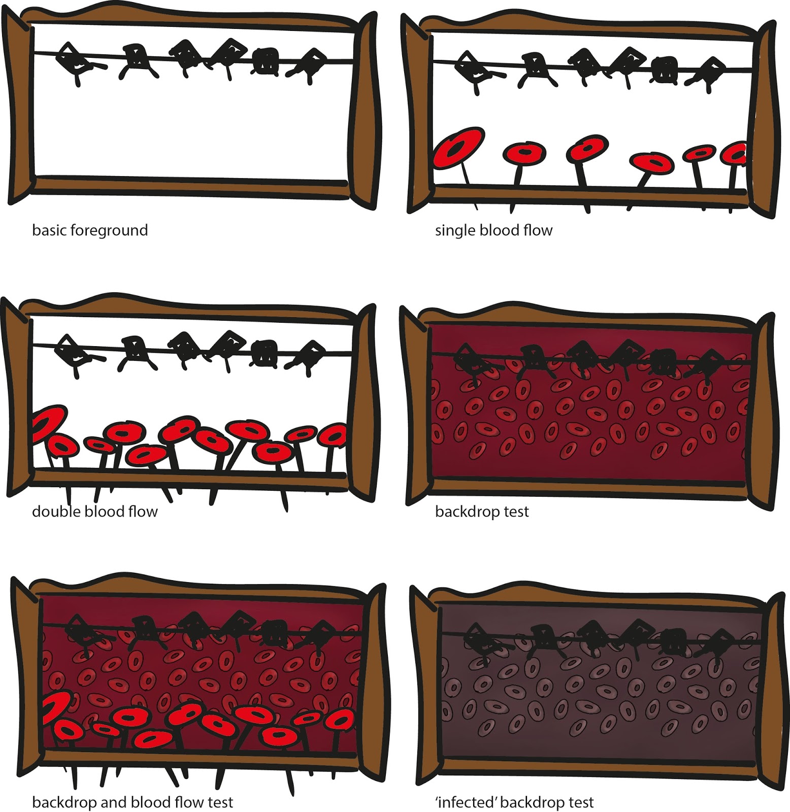
These drawings are some quick sketches that helped me to re-imagine the project. I've used the blood flow concept art as a 'backdrop'. The fuller colour makes it look like the body is heathy. The darker version looks diseased and pushes the infected feel across. The backdrops will be changing through out as they would in a normal theatre production and there will be a 'lighting' bar that is clearly seen. Normally this would be hidden behind a 'border' but I like the exposed look. I'm also thinking about using the 'borders' and curtains during the animation to help restrict the view even further to draw in interest to certain points of the animation.
So far, I'm thinking that my story will be focused more on facts than on a fictional story and I hope to have a rough draft up of my ideas in the next day or two.
Sunday, 21 February 2016
Laurel and Hardy Edit | Photoshop | Personal Work
Friday, 15 January 2016
Arthur Christmas | Photoshop | Work in Progress | Personal Work | From Script to Screen
After doing my like for like storyboard, I found that Arthur was a really nice character to draw. This is the start of a drawing that I have done of him. I'm planning to finish this later but I'm definitely proud of this work so far.
Sunday, 20 December 2015
Santa (with directions from a 4yr old) | Personal Work | Timed | Photoshop
Originally this started out as a drawing challenge for myself but with a 4 year old jabbering in my ear it became a quick time challenge with his art direction.
It HAD to look like it was snowing, with a RED hat and coat and a BIG beard... Oh and we NEEDED Santa's name written on it too. Alll under 4 minutes as he was getting impatient...
I'll redo this challenge again later when he's not next to me so I draw without him poking the screen or grabbing the pen or making silly noises....
Wednesday, 9 December 2015
Ice Landscape Test | Photoshop | What If
![]() |
| Original Attempt |
![]() |
| With help from Jordan |
Monday, 30 November 2015
Concept Art Update | Photoshop | What If
The repaint of my concept art is almost complete. It's been taking a lot longer to complete than I first thought it would but I'm definitely happy with the progress I've made so far on it. I just need to add in the windows and doors with a few final touches and it will be done!
Tuesday, 24 November 2015
Progress of Rework | Photoshop | What If
I've been carrying on with the rework of my final concept art. I'm happy with this layout and I'm now using the new techniques Jordan had shown me yesterday to help rework and paint into my piece.
Work so far:
Work so far:
- I've sorted the sky and the skyline to show the city extending back further.
- Grass, hill and path have been extended and merged together a little better with hightlights.
- Started the paint over of three of the buildings as the black outline around them breaks the illusions of depth.
Monday, 23 November 2015
Rework of Final Concept Art | Photoshop | What If
![]() |
| New Composition |
![]() |
| Help from Jordan and learning new techniques |
Following on from my recent OGR feedback, I have rearranged my composition to have the outcome above. I think this is starting to feel much more like a city. I have had a chat with Jordan about what to do next with my final piece and have written a lot of notes down with next ideas and techniques to try out. I shall scan these later on and put them on the blog as reference and carry on working into the piece.
Thursday, 19 November 2015
Final Concept Art | Photoshop | What If
Scale Comparison of Buildings | Photoshop | What If
Once my orthographs were completed, I wanted to show the difference in size for them all. If all of the buildings were on a flat piece of land, this is how they would look side by side in front view, back view and side view.
Orthographs 3 | Photoshop | What If
Here are the final orthographs for buildings 5 and 6 of my city. My favourite out all all of them definitely has to be building 6 and its bubble like appearance. I'm thinking of doing a 'scaled orthograph' where all the buildings are lined up side by side for each view to show the size difference between the buildings.
Orthographs 2 | Photoshop | What If
This is my second page of orthographs. Once again, I've added in a basic colour version beneath with the texture to show how they look as line work and as the model itself.
Wednesday, 18 November 2015
Orthographs 1 | Photoshop | What If
These are the orthographs for the first two buildings. I've also placed below it the final colouring and textures onto them for comparison. I think they look great so far and the scale of them is really starting to become clear. They should be straight forward to model in Maya because of their repetitive nature which will be helpful when modelling.
Colour Tests 2 | Photoshop | What If
This is the second page of colour tests that I have done. This is quite an odd building for me to visualise in any colour other than the original green so 9 different colours were a great way to see the textures and shapes etc.
Colour Tests 1 | Photoshop | What If
Whilst working on the orthographs for the buildings, I thought it would be the perfect opportunity to test out the colours using the palette I've selected from Iris's work. I've created these 6 versions of the first building and I think all of them work really well! Just by changing the colour, it is giving them the illusion of different rock types. Initially I think I'm going to use number 3 (top right) as its more subdued and doesn't jump out at you, although I might change this later on.
Subscribe to:
Posts (Atom)


