Monday, 29 February 2016

Initial Ideas and Audience Research | Fantastic Voyage


I have been researching around my idea of a paper cut puppet theatre. I think this idea is best suited in Maya and can be constructed easily in sections of panels, evenly spaced apart.
The first shall be a theatre front. The next 2 layers are side curtains for the stage and the back will be a changing backdrop to help move the animation along.

I began designing some of the main components like the cells and how they might work in a cam belt like setting. This will allow a constant flow to imitate the blood. I have yet to solidify the story but I think that animating in this way will be interesting to do.

Colour and shading will be best in matte and muted tones with a slight texturing. A toon shader might also work well with this to achieve a disney-esque look but may impact upon the paper cut look I am trying to achieve.

I also did a small bit of market research into what audience would best fit my animation. I'm hoping that my animation would be family friendly and appeal to all ages but realistically, I am looking to focus on the young children to young adults. This means that the scientific terms may be used but I do not need to overfill the animation with the terminology.

Saturday, 27 February 2016

Art Style and Influences | Fantastic Voyage


I've been exploring into Hattie Newman's work and her use of layering her sets to create a 3D piece out of 2D components. What I would like to do is take this aspect and try to place in some influences from classic Disney pieces like Dumbo, Robin Hood and Fantasia and try to incorporate it into Hattie's style to try and create a documentary that tells the story of how the body becomes immune to infection. This will be done in a papercut style but first I want to explore further into how the story will unfold and the science behind it.

Sunday, 21 February 2016

Laurel and Hardy Edit | Photoshop | Personal Work

Original Image
Final Edit

My dad asked me to edit this photo of his friends as a joke and make them look like they were in a Laurel and Hardy scene. It was a fun edit to do and I hear it has now been framed and given to them. UPDATE: Its now hanging on the wall in their office!)


Wednesday, 17 February 2016

Colour Comps | Jake | Main Character | Illustrator | From Script to Screen


These are the colour comps for Jake, the main character in my script. I really like the plain neutral colours of 4, clothing wise but I also like the bolder tones in 5.

Tuesday, 16 February 2016

Feedback please | Test Pre-viz | From Script to Screen


While working on computerizing my storyboard, I thought I should test it out in terms of a pre-viz incase I need to add in some extra shots or even remove some to make it flow. This was made using the original pencil storyboard.

If anyone has any feedback on the shots used or the timing, it would be much appreciated.

Final Script | From Script to Screen

At the moment, this is my final script for the project. (if there are any spelling mistakes or mistakes that I haven't noticed, please let me know and I will change and update it)

Monday, 15 February 2016

Original Storyboard | From Script to Screen


This is my original storyboards for my animation. I'm currently in the process of computerizing these images but thought I should have a separate post with just the storyboards.

Friday, 12 February 2016

Jake | Main Character | From Script to Screen


This is Jake, my main character. Before I began my storyboard I did draw him by hand but I've now computerized him in Illustrator. I've coloured him with some basic, natural tones. Next, I want to do a few colour comps of him just to get a feel of how he could look in the environments and then side by side with the other interns.

Pre-Vis | Work in Progress | Main Factory | From Script to Screen


I've been struggling with the layout of my factory and how to draw it for my storyboards so I have created a quick mock up which will be used as part of my pre-vis. Although it is not completed it is really helping with how my factory layout could potentially be seen and will be a great help when drawing these scenes. This is a work in progress and may potentially change layout as I begin to draw my storyboard out more for the animatic.

Elf Tanks | Illustrator | From Script to Screen


This is part of one of the environments that will feature at the end of my story where Jake stumbles into the 'cloning room'. Here we see two former interns that have been transformed into elves and featuring the bauble gas masks. This is only part of the room and I will be drawing more of it shortly.

Wednesday, 10 February 2016

Pre-vis Set | Maya


We created a basic set in Maya for use as a Pre-vis. Its in the style of an old school detective office. I've mapped out a few basic items like some lights, rug, desk, chair and two bookshelves full of books. Its fun to create sets like these as you can create a basic set quite quickly without worrying about the poly count.

9/02/2016 | Life Drawing


In life drawing, our model went home ill. Instead Vicky, did two poses for us. This was a little harder than I expected. I've become used to proportioning but drawing clothes and the way they folded proved harder than I first thought it would be. Then we had to try and draw other peoples faces. This is also a lot harder to do and a lot of laughs were had. I think I'll retry this exercise at a later date.

Tuesday, 2 February 2016

Environment Design | Character Design Workshop

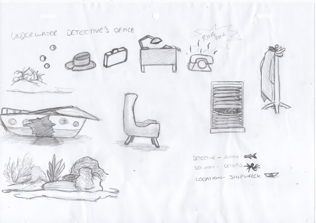
For this lesson we were given a random location and had to design the aspects of the room. I was given an 'Underwater Detectives Office'.


The first thing I did was brainstorm all objects/items that related to the themes of underwater and deceives. This proved a great way to help me combine the two ideas together.


Justin helped me to create a basic floor map which ultimately helped me to create the scene. I also played around with the idea that it was marine characters taking the roles so I created the shark detective and his girly octopus assistant.


Updated Script | 2nd Draft | From Script to Screen

The Sporty Blimp | Flash | Animation


In Meg's lesson we had to pick 2 sets of words out of a hat. I chose 'sporty' and 'blimp'. 
My design was based around steampunk colours and racing. This allowed me to give the blimp some goggles and racing strips while keeping the colours to a minimal. I also attempted a basic animation with the blimp flying on and off screen. This was a test to see if this shape worked visually.

Warehouse Research | From Script to Screen

The whole of my animation takes place inside of a large warehouse. Although set in several different rooms within the building, I felt like it was necessary to look into warehouse shapes, locations and reoccurring designs.

I'm assuming that most of the warehouses as shown above are from the shape time period as they all have the large glass windows (sometimes spanning 2 floors or more for maximum light), wooden flooring, large brick columns to support the roofs of the large open spaces. details like this will be really nice to add into my work and will give the environment more character.